Update: 22 July 2024 for Release v197
New layout options for productions & events
Did you know that your Calendar can display your events in multiple ways? Perhaps you have heard about the Brochure view, but there are some more cool layouts at your fingertips. These options are only available on bigger screens. On mobile devices, all events will automatically be shown in the same (for mobile optimized) layout.
You can apply different layouts to your entire Calendar:
- Default list layout, grouped by production,
- Default list layout, displaying each event individually by date
- Brochure layout, for a grid of productions, with a pop-up that enables quick browsing through your selection
- Mobile layout, which is a grid that features every production in the mobile card-layout

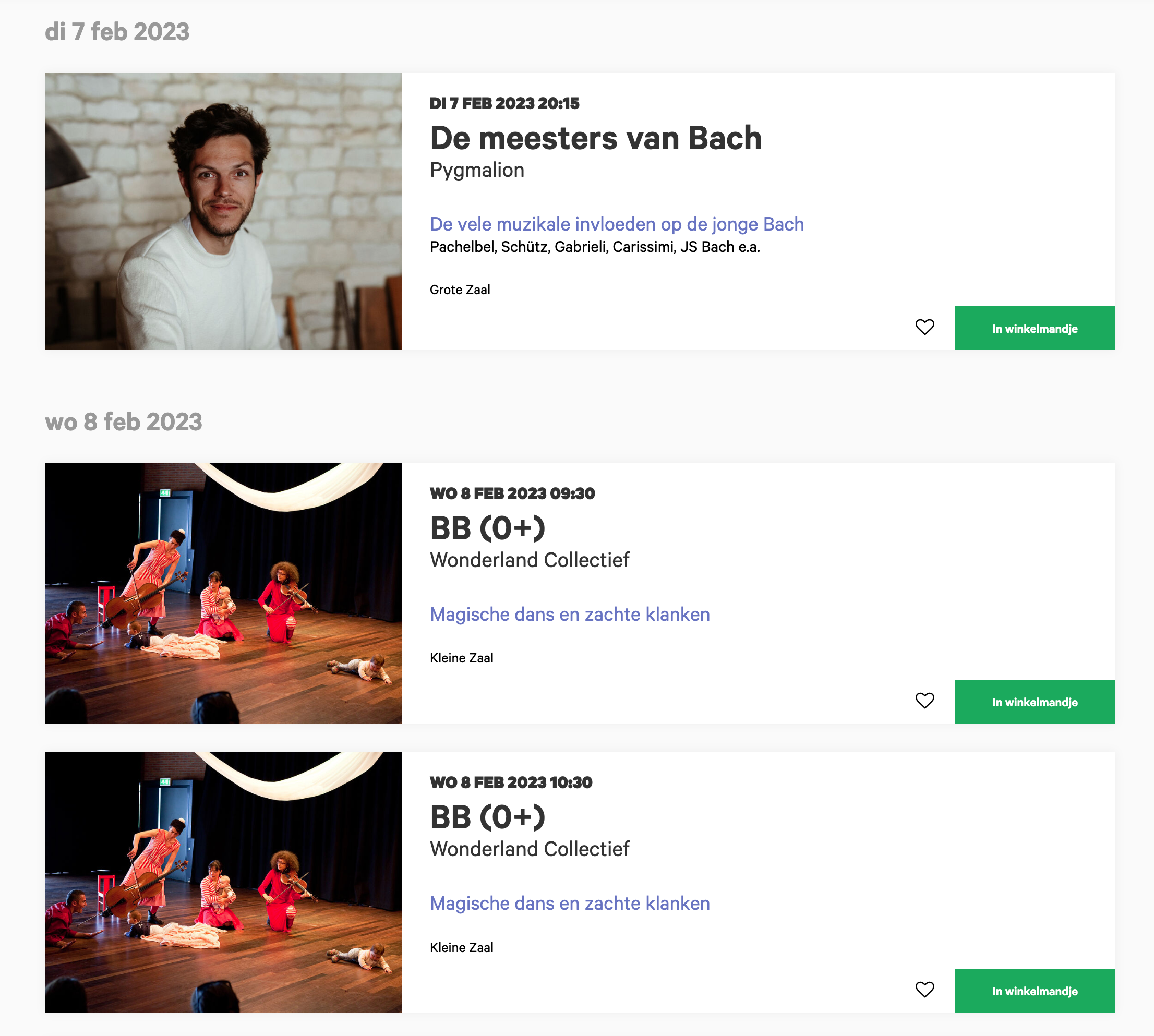
"Default" list with production grouping

"Default" list, chronological

Compact list

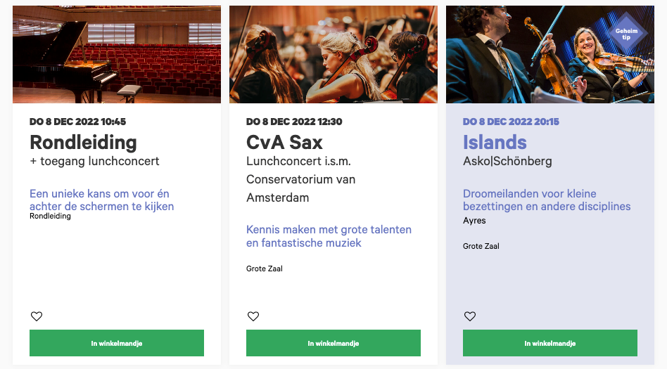
Brochure view with popup and browsing

Mobile cards in a grid
Furthermore, an option is available to select the amount of items that are displayed on the page.
Activate a layout by putting the variable in the url
All this works via new parameters in the URL itself, so you can check it out directly on your own website now. You can also make links to specific layouts by putting these variables directly into the URL and use this in a button or a banner.
You want to show a brochure view of all your Opera events? no problem! Perhaps a compact list view of all events in one of your locations? Sure! Just filter on location or genre in your regular Calendar, and then add one of the following variables in the url:
?list_type=events (for chronological list)
?layout=normal (for grouped list)
?layout=brochure
?layout=compact
?layout=mobile-ish
?max=[a number]
Combine multiple variables for more fun:
/programma?layout=brochure&max=8 links to a brochure view with 8 items per page, while
/programma?layout=normal&max=24 links to a “normal” list view with 24 items per page.
Adding layout icons to your Calendar filter
The filter in your calendar overview has a new section at the bottom, where the selected filters are shown.
Right next to the selected filters we made room for some icons for visitors to change the layout of the overview themselves (This is not shown on mobile devices because these options do not feature on mobile screens).
All the options can be individually shown or hidden to your wishes. Just manage them in the control panel > Events & Productions.
Layouts of your calendar filter
The filter at the top of your calendar can also be configured in three different ways:
- Default
- Sentence
- Sidebar
The default filter
The default filter can be minimized in to show only the basic selection, or folded out to show extra options, like genres, tags, locations.

You can choose if the filter is shown folded out or folded in by adjusting the parameter "FiltersDefaultCollapsed" in the "Events" part in your "Routes & Parts" module in the dashboard (1 is folded in, 0 is folded out).
What options you want to show in the minimized view can be changed in the parameter "filter" (Also in the "Events" part in your "Routes & Parts" module). Values are "date" "genre" "location" and "theme".

When a visitor opens or closes the filter, the last position will be remembered in that web browser.
The sentence filter
The sentence filter has a limited subset of options. You can select a date range, genres and locations.

The filter can be activated by adding the parameter "filters" in the "Events" part in your "Routes & Parts" module in the dashboard,with the value "sentence".

The sidebar filter
The sidebar filter has all the options of the default filter. The filter is positioned on the side of the desktop view of the calendar. On mobile it changes into a slider you can open and close.

The filter can be activated by adding the parameter "filters" in the "Events" part in your "Routes & Parts" module in the dashboard,with the value "sidebar".

Option to disable event date fold-out in What’s On pages to go straight to detail page
There is a new setting (as of v198) to disable the event fold-out on the What’s On/Agenda page for Productions.
When this option is active, it replaces the event dates fold-out button (“show dates”) with a link directly to the detailpage. This is especially convenient when Productions have a lot of Events, and you want to avoid long lists with dates in the What’s On page.
New Setting!
Control Panel > Events > Event Cards > Cards always link to detail


